


TJStats Pitching Summary Primer
Teaching sabermetrics through graphics

Code for my pitching summaries can be found here
Introduction
I love baseball and I love utilizing baseball data to produce visualizations to help understand analytics. One of my favourite projects I undertook was creating a “Pitching Summary” to help synthesize data in a more digestible format. Over time, I made meaningful changes to the design of my graphic thanks to the constructive feedback of others.
You may have seen some of my graphics out in the wild, such as this season long summary for Kris Bubic:

This graphic presents a ton of information. This may feel overwhelming to you, and that is ok. I want to help you understand what is being presented. This article will break down the components of these summaries and how I use them to gain actionable insight.
Layout
The graphic is essentially split into 4 sections:
Player Data
Season Summary Table
Pitch Data Plots
Pitch Data Table
Here is the layout of the graphic and the respective sections.

Player Data

This section contains information pertaining to biographical and team data of a player. These parts of the graphic are mostly self-explanatory as they include images of a player’s headshots and their respective team’s logo. It also contains information such as name, age, height, weight, and handedness.
Season Summary

This section includes a table which summarizes a pitcher’s results in a given date range. It includes 8 stats which help me assess a player’s performance and provide a good understanding of how they have fared in this timeframe.
These stats are:
IP - Innings Pitched: The number of innings (or outs) a pitcher has completed
IP are the basis to qualify for any rate statistic and provides information for how many outs they have recorded this season
PA - Plate Appearances
I like using PA because it helps us understand how efficient a pitcher is with their outs. If a pitcher can minimize the number of batters they face, the better!
WHIP - Walks+Hits per IP
WHIP is a good proxy for efficiency because it covers the most common ways for a batter to reach base. WHIP under 1.00 are considered elite
ERA - Earned Run Average
ERA describes how often a pitcher allows a batter to score. It is not a flawless statistic as there is a lot of randomness it does not account for, but typically the best pitchers have the lowest ERA
FIP - Fielding Independent Pitching
FIP is a descriptive statistic that aims to minimize the noise found in ERA. It considers the plays that pitchers have full control over (K, BB, HBP, HR) and is scaled to league ERA. It is my go-to ERA indicator.
K% - Strikeout Percentage
The ratio of strikeouts to plate appearances. What is otherwise a simple statistic, K% is the driving factor for being an effective pitcher
BB% - Walk Percentage
The ratio of walks to plate appearances. BB% is not as meaningful as K%, but it works as an effective proxy for assessing command
K-BB% - Strikeout minus Walk Percentage
Simply the subtraction of K% and BB%. It is one of the best predictors of future performance and its simplistic nature makes it easy to understand and apply
These are not the only metrics that are valuable when assessing a pitcher’s performance. Others include GB%, xFIP, and xERA.
Pitch Data Plots

This section of the graphic includes subplots that illustrate a pitcher’s arsenal and their individual pitch data. I will cover each of these plots separately and focus on what makes them important.
Pitch Velocity Distribution

This plot illustrates a pitcher’s velocity with smoothed histograms. It splits up each pitch into their respective pitch type and also includes a dashed line to indicate the pitcher’s average velocity. The dotted line indicates the MLB average. This plot helps with understanding where a pitcher sits relative to their counterparts. It also provides us information about their maximum velocity.
Pitch Breaks

This is the short-form pitch movement plot of a given pitcher, which shows how spin affects pitch movement. The horizontal axis represents Horizontal Break (HB), which is the side-to-side movement of the pitch parallel to the ground, caused primarily by sidespin. In these plots, positive HB indicates movement toward the pitcher’s arm side, while negative HB reflects movement toward the glove side.
The vertical axis shows Induced Vertical Break (iVB); the pitch's movement up or down due to spin alone, not gravity. A positive iVB means backspin is causing the pitch to resist gravity and drop less, like a 4-Seam fastball. A negative iVB means topspin is causing the pitch to drop more than gravity alone, like with a curveball.
The center of the plot represents no movement due to spin. This kind of straight flight is typical of other projectiles like footballs and bullets, which spin along the axis of their flight path. This kind of spin stabilizes their motion but doesn’t cause additional movement. When we refer to pitches in this zone, we typically use the term “gyro” to describe its gyroscopic spin.
In summary, this plot illustrates how a pitcher’s pitches move in space by the spin they impart on the ball. The movement of a pitch is a key aspect in understanding what makes them effective.
Pitch Usage

This plot illustrates a pitcher’s usage depending on batter handedness. This provides us a quick way to understand how a pitcher utilizes their arsenal depending on the situation. For example, Kris Bubic uses his fastball as his primary offering vs RHH, but dials back its usage in favour of his secondaries against LHH. We can also see that Bubic exclusively uses his changeup vs RHH while he opts for his sinker vs LHH. Intuitively this makes sense because of how the movement of those offerings have historically performed, and it’s cool to see it put into action.
Pitch Data Table
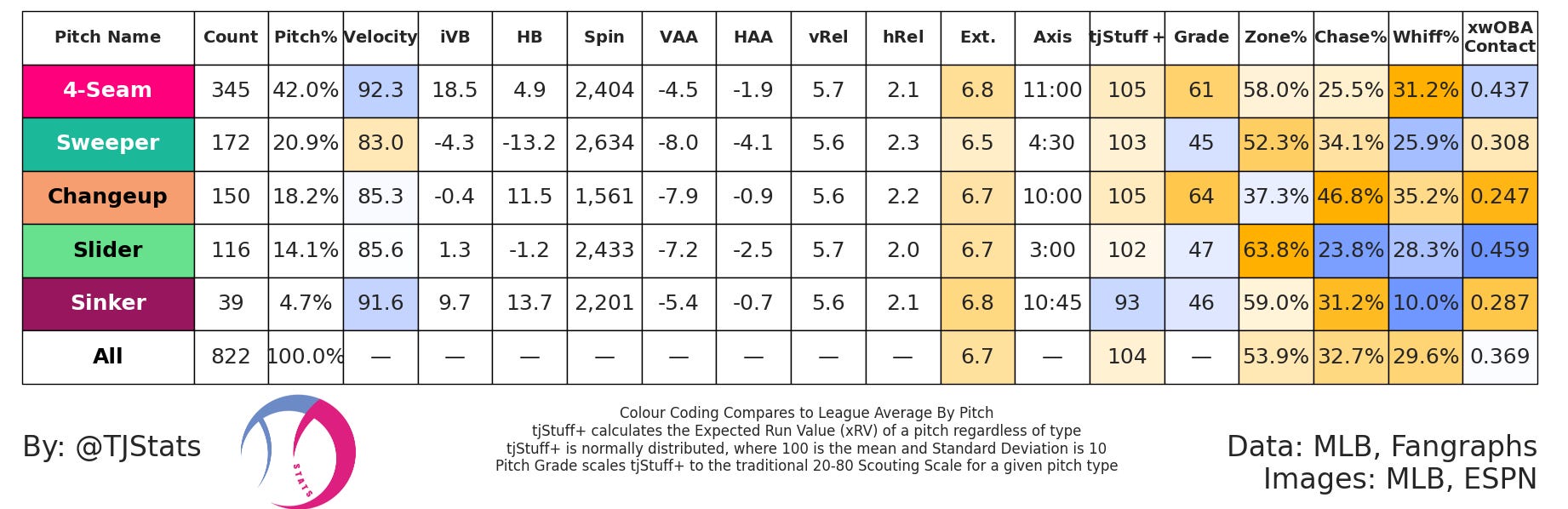
This table summarizes important metrics pertaining to a pitcher’s arsenal and includes both usage, shape data, as well as results.
These columns are:
Pitch Type
The type of pitch as tagged by MLB Pitch Tracking
Count
The number of pitches of a given type
Pitch%
The proportion of pitches count compared to all other pitches. Also known as Usage%
Velocity
The average velocity, in MPH, of a given pitch type
iVB - Induced Vertical Break
The average induced vertical break, in inches, of a given pitch type. This explains the movement of a pitch perpendicular to the ground due to spin and how it moves vertically without considering gravity.
HB - Horizontal Break
The average induced vertical break, in inches, of a given pitch type. This explains the movement of a pitch parallel to the ground due to spin and how it moves horizontally.
Spin - Spin Rate (RPM)
The average spin rate, in RPM, of a given pitch type. Spin rate on its own isn’t a very useful measure of a pitch’s effectiveness, although it can provide some insight into the potential of a pitcher’s arsenal. For example, pitchers that can generate high spin rates on their breaking balls (sliders, curveballs, etc.) may have the ability to add in different variations such as sweepers and slurves.
VAA - Vertical Approach Angle (°)
The downward angle (in degrees) at which a pitch crosses the front of home plate. More negative means the pitch is steeper as it crosses the plate.
HAA - Horizontal Approach Angle (°)
The side-to-side angle at which a pitch crosses the plate (in degrees). Closer to 0 indicates that the pitch is perpendicular to the front of home plate.
vRel - Vertical Release Point (ft)
The vertical release of a pitch from the pitcher’s hand relative to the ground. Understanding how a pitcher’s release impacts the shape of their arsenal as well as their ability to impart spin on the ball is important in both pitch design and player evaluation.
hRel
The horizontal release of a pitch from the pitcher’s hand relative to the center of the mound. Understanding how a pitcher’s release impacts the shape of their arsenal as well as their ability to impart spin on the ball is important in both pitch design and player evaluation.
Ext - Extension (ft)
The distance towards home plate that a pitcher releases the baseball from the mound. Typically, higher extension is desirable because it leads to higher perceived velocities. MLB average extension is ~6.5 ft with +7 ft being considered elite.
Axis - Spin Axis
The direction of the balls rotation as it leaves the pitcher’s hand in relation to a clock, where 12:00 is considered pure back-spin and 6:00 is considered pure top-spin. The axis of the pitch helps in understanding a pitch’s movement due to spin. For example, fastballs typically have movement near 12:00, indicating that they have a lot of backspin, and therefore higher iVB.
tjStuff+
A pitch model I developed that aims to predict the run value of a pitch, where 100 is considered average with 10 as the standard deviation. The model compares all pitches to one another and assigns a value indicating how effective the pitch is relative to league average. You can read more about my tjStuff+ model here.
Grade
This value aims to contextualize tjStuff+ for a given pitch type by grading the pitch on the 20-80 scale, where 50 is considered average with 10 as the standard deviation. This value helps compare the same pitch type to one another. You can read more about my tjStuff+ model here.
Zone%
The percentage of pitches that land in the strike zone, regardless of their outcome. I like to use Zone% as a proxy for control because it describes how consistent a pitcher is at throwing strikes.
Chase%
The percentage of pitches outside the zone that are swung at. Chase% (also referred to as O-Swing%) helps explain which pitchers and/or pitches are effective at deceiving batters and generating poor swings. Higher Chase% pitchers tend to run lower BB%.
Whiff%
The percentage of swings that result in a whiff. Whiff% is one of the best indicators for K% as it describes how effective a pitcher is at generating swings and misses.
xwOBACON
Expected weighted on base average on contact. Although it is a mouthful, it basically describes the damage a pitcher allows based on factors such as exit velocity and launch angle. Lower xwOBACON is favourable because it indicates that a pitcher is effective at limiting hand contact and/or inducing ground balls.
You will also see that some of these columns are colour coded. This colour coding indicates where these metrics stand compared to league average. Yellow means “better” than league average, where blue means “worse” that league. Not all columns have this coding because there is more nuance when describing these metrics. For example, what is a “better” iVB? A higher iVB may be beneficial for a fastball, but that likely does not hold true for a changeup.
Conclusion
My goal is to help others become more familiar with baseball analytics and have a better understanding of how we can leverage these advanced statistics to formulate more sound analysis. I hope this article helped you better understand my pitching summaries and also provided insight on pitching as a whole. If you are interested in learning how I generate these graphics, check out my article and GitHub Repo below.
Medium Article: Medium article on my pything summaries
Check out the GitHub Repo: https://github.com/tnestico/pitching_summary
Follow me on Twitter: @TJStats
Follow me on BlueSky: @tjstats.ca
Consider Supporting me on Patreon: TJStats
thank you so much!!
I am just looking for such a great material!
I'm a big fan from Japan
Thank you for breaking this down so well! I've seen these graphics all over the place but had little idea how to read them!